Analysing Apache Logs: gnuplot and awk
The Apache http logs
I wanted to make a graph on the amount of data served from by Apache server, with a bit finer granularity than AWStats could give. The http_access file has all the information I needed, including the time of each request and bytes served. Assuming the standard combined format, the time stamp is at the 4th field, and the bytes served at the 10th.
Thus, the following will isolate the necessary data for my graph. (Note, the log can usually be found at /var/log/httpd/access_log).
cat /tmp/access | cut -f 4,10 -d ' '
However, it turns out not all log entries store the bytes served. This includes file not found, and certain requests which return no data. Some cases will have a hyphen, while others will simply be blank. To pick out only the lines which contained data, I appended the line above with:
cat /tmp/access | cut -f 4,10 -d ' ' | egrep ".* [0-9]+"
The first plot
This is enough to start working with in gnuplot. First we have to set the time format of the x-axis. The Apache log file is on this format: "[10/Oct/2000:13:55:36", or in terms of strftime(3) format: "[%d/%b/%Y:%H:%M:%S". (Note that the opening bracket from the log is included in the formatting string).
To set the time format in gnuplot, and furthermore specify that we work with time on the x-axis:
set timefmt "[%d/%b/%Y:%H:%M:%S"

set xdata time
The data can then be plotted with the following command:
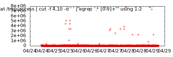
plot "< cat /tmp/access | cut -f 4,10 -d ' ' | egrep '.* [0-9]+'" using 1:2
To output to file, the following will do. The graph below shows the served files from my logs in the last couple of days.
set terminal png size 600,200

set output "/tmp/gnuplot_first.png"
Improvements
There are a few improvements to be made on the graph above: Most importantly the data is slightly misleading, since files served at the same time is not accumulated. Furthermore, the aesthetics like legend, axis units, and title formatting are missing. Also note that the graph is scaled to a few outliers: I have a 7 MB video on my blog, which is downloaded occasionally. For the following examples, I will focus on the first day, where this file is not included.
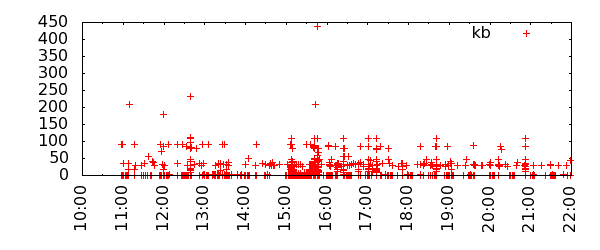
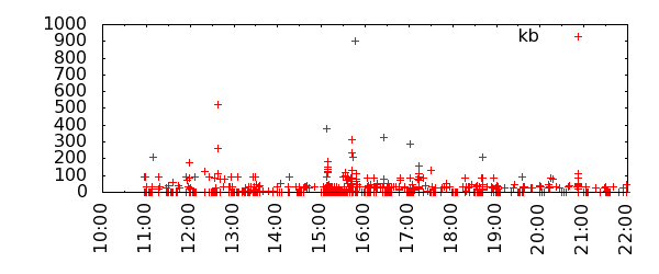
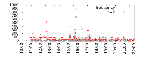
First, I've made some minor improvements, and in the second graph I've applied the "frequency" smoothing function. Notice how the first graph has a maximum around 440 kb, while the smoothed and accumulated graph below peaks at around 900.
set terminal png size 600,250

set xtics rotate

set xrange [:"[24/Apr/2011:22"]
plot "< cat /tmp/access | cut -f 4,10 -d ' ' | egrep '.* [0-9]+'" using 1:($2/1000) title "kb" with points
plot "< cat /tmp/access | cut -f 4,10 -d ' ' | egrep '.* [0-9]+'" using 1:($2/1000) title "kb" smooth frequency with points
awk
Although the frequency smoothing function gives an accurate picture, some of the accumulations are done at a too wide range, thus giving the impression of higher load than is the case. Another way to sum up the data is to aggregate all request on the same second into a sum. This can be done with the following awk script:
awk '{ date=$1; if (date==olddate) sum=sum+$2; else { if (olddate!="") {print olddate,sum}; olddate=date; sum=$2}} END {print date,sum}'
The input still has to be scrubbed, so the final line looks like this:
cat /tmp/access | cut -f 4,10 -d ' ' | egrep ".* [0-9]+$" | awk '{ date=$1; if (date==olddate) sum=sum+$2; else { if (olddate!="") {print olddate,sum}; olddate=date; sum=$2}} END {print date,sum}' > /tmp/access_awk
Plotting these two functions in the same graphs shows the difference between the peaks of the frequency function, and the simple aggregation:
plot "< cat /tmp/access | cut -f 4,10 -d ' ' | egrep '.* [0-9]+'" using 1:($2/1000) title "frequency" smooth frequency with points, "/tmp/access_awk" using 1:($2/1000) title "awk" with points lt 0
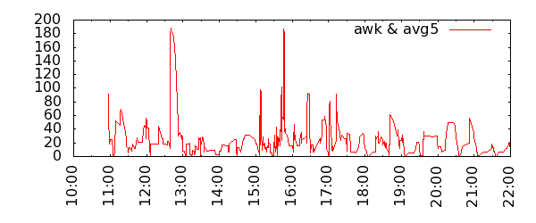
Moving average in Gnuplot
For the daily graph, I think I'd prefer the one using the awk output, and perhaps using lines or "impulses" as style instead. However, it does not address the outliers. To smooth them out, we could try a moving average. This is not supported by any native function in gnuplot, so we have to roll our own. Thanks to Ethan A Merritt, there is an example of this.
Of course, this will put a lot less emphasis on peaks, and the outlier at 650 kb in the graphs above is now represented with a spike of less than 200. Furthermore, there is a problem with the moving average of time data of inconsistent frequency. The values will be the same whether the last five request were over an hour or a few seconds.
samples(x) = $0 > 4 ? 5 : ($0+1)

avg5(x) = (shift5(x), (back1+back2+back3+back4+back5)/samples($0))

shift5(x) = (back5 = back4, back4 = back3, back3 = back2, back2 = back1, back1 = x)

init(x) = (back1 = back2 = back3 = back4 = back5 = 0)
plot init(0) notitle, "/tmp/access_awk" using 1:(avg5($2/1000)) title "awk & avg5" with lines lt 1
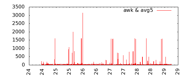
Zooming out to the day view, the average is maybe more appropriate here, since data is overall on a more consistent frequency.
set xrange [*:*]

set format x "%d"
plot "/tmp/access_awk" using 1:(avg5($2/1000)) title "awk & avg5" with lines
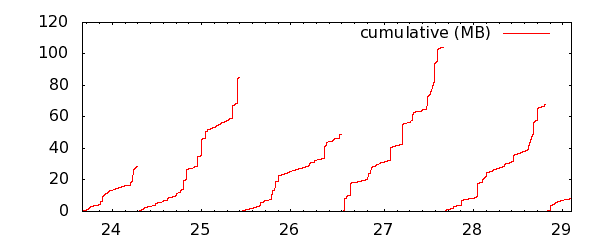
Cumulative
Finally, another interesting view is the cumulative output day by day. This can easily be achieved by inserting a blank line in the data file between each day. In awk, using the previous sum file generated above, it can be done like this:
cat /tmp/access_awk | awk 'BEGIN { FS = ":" } ; { date=$1; if (date==olddate) print $0; else { print ""; print $0; olddate=date}}' > /tmp/access_awk_days
Or an alternative, based on the original access_log file. The aggregation per second this not necessary, since the "cumulative" function will do the same operation, and the graph will be exactly the same:
cat /tmp/access | cut -f 4,10 -d ' ' | egrep ".* [0-9]+$" | awk 'BEGIN { FS = ":" } ; { date=$1; if (date==olddate) print $0; else { print ""; print $0; olddate=date}}' > /tmp/access_awk_days
And the gnuplot. Note that the tics on the x-axis are set manually here, starting on a day before the first day in plot, and ending on the last. The increment is set to a bit less than a day in seconds (60 * 60 * 24 = 86400) to approximately center it under each line. Also note, that the format of the start and end arguments still have to be the same as set in the beginning, with timefmt.
set xtics "[23/Apr/2011:0:0:0", 76400, "[29/Apr/2011:23:59:59"

set format x "%d"
plot "/tmp/access_awk_days" using 1:($2/1000000) title "cumulative (MB)" smooth cumulative